Ten Beautiful Books to Give as Christmas Gifts

The advent of the eReader did not, after all, signify the end of the book. Sales of physical books are up and, to meet the demand, publishers are increasingly issuing beautifully designed and illustrated editions you’ll love to look at as much as you love to read. And, these beautiful books are perfect gifts. Here are ten that are on my Christmas list…

As Kingfishers Catch Fire
As Kingfishers Catch Fire: Birds & Books
by Alex Preston, illustrated by Neil Gower

For the birdwatcher in your life, As Kingfishers Catch Fire is a gorgeously illustrated meditation on the endless grace and variety of birds. Tom Holland calls it, ‘A magical book: an inimitable fusion of ornithology, literary anthology and autobiography.’


Making Winter
Making Winter: A Creative Guide for Surviving the Winter Months
by Emma Mitchell

I was fortunate enough to attend one of Emma’s Silver Clay workshops in Cambridgeshire last year and so can confidently testify that she embodies the Danish philosophy of Hygge. Her Instagram feed is a delight to the eyes. Making Winter is a book full of her wonderful images and inspiring ideas for nature-orientated crafts.


Alias Grace
Alias Grace
by Margaret Atwood

For the box set binge-watcher, if you were captivated by The Handmaid’s Tale, another of Margaret Atwood’s novels has been adapted for TV and is now available on Netflix. Alias Grace is based on a true story, explored and unravelled with all of Margaret Atwood’s trademark subtlety and ambiguity. But, of course, you should read the book first, and it’s available in this stunning hardback edition.


Baking with Kafka
Baking with Kafka
by Tom Gauld

Tom Gauld is a regular cartoonist for The New Yorker, The New York Times, New Scientist and The Guardian, amongst others, and I love his signature wry, fatalistic humour. In Baking with Kafka, he explores important questions like: How do you get published during a skeleton apocalypse? What was the secret of Kafka’s lemon drizzle cake? And, What plot possibilities does the exploding e-cigarette offer modern mystery writers?

The Lost words
The Lost Words
by Robert Macfarlane, illustrated by Jackie Morris

We’ve heard that terms relating to the natural world are disappearing from the dictionary as they fall out of use: words like dandelion, otter, bramble and acorn. The Lost Words is a collection of acrostic spell-poems, exquisitely illustrated by Jackie Morris, created with the intention of reclaiming these words and ‘re-wilding the language of children’. (It’s also a gigantic book – two feet high!)


Gentleman-in-moscow
A Gentleman in Moscow
by Amor Towles 

On 21 June 1922 Count Alexander Rostov is sentenced to house arrest in the Hotel Metropol, his life is only spared because he once wrote a socialist-sympathising poem. Over the next forty years the Count makes a life within the confines of the hotel against the backdrop of a politically tumultuous period in Russian history. The first half is quite anecdotal, but if you persevere the main impetus of the narrative becomes clear in the second half and the final chapters are sublime. A Gentleman in Moscow is available in this stunning black and gold hardback edition.

The Bear and the Nightingale
The Bear and the Nightingale (The Winternight Trilogy #1)
by Katherine Arden

For lovers of fantasy, Vasya lives in a small village in the woods in northern Russia. She has grown up hearing stories of the ‘Winter King’, a Russian equivalent of Jack Frost: ‘Frost-demons have no interest in mortal girls wed to mortal men. In the stories, they only come for the wild maiden.’ In addition to her wild wandering in the woods, Vasya has special gifts – she alone can see the household spirits that protect their home and she can talk to horses. When a young, fervent Christian priest arrives in their village and turns people against the old gods and superstitions, he upsets the balance of nature and unwittingly prepares the way for one much more dangerous than the Winter King. Vasya must remain free of societal constraints to protect her family and her village from this threat. This story reads like a beautifully woven Russian folk tale – thrillingly atmospheric, lyrical and otherworldly.

The Language of Thorns
The Language of Thorns: Midnight Tales and Dangerous Magic
by Leigh Bardugo, illustrated by Sara Kipin 

For your teenager, whether they are familiar with the world of Leigh Bardugo’s ‘Grishaverse’ or not, they will enjoy the lavish illustrations and beguiling tales of ‘dark bargains struck by moonlight, of haunted towns and hungry woods, of talking beasts and gingerbread golems, where a young mermaid’s voice can summon deadly storms and where a river might do a love-struck boy’s bidding but only for a terrible price.’

A Skinful of Shadows
by Frances Hardinge

My go-to book for children’s birthday presents last year was Frances Hardinge’s superb novel, The Lie Tree. Her new book is out and available in a striking hardback edition. A Skinful of Shadows is the story of twelve-year-old Makepeace, a ‘bear-hearted girl’ who becomes possessed by a spirit which gives her strength when she is sent away to live with rich and powerful relatives and faces the possibility of civil war. But it’s not just for the kids, Hardinge is a mesmerising storyteller and I’ll definitely be reading this one too.


Goodnight Stories for Rebel Girls
Good Night Stories for Rebel Girls
by Elena Favilli, Francesca Cavallo

A great empowering feminist read for your daughter, Good Night Stories for Rebel Girls is the result of a viral crowdfunding campaign to highlight strong female role models in books. It is vibrantly illustrated by sixty female artists from all over the world, and introduces us to one hundred remarkable women and their inspirational lives, including Ada Lovelace, Malala, Amelia Earhart and Michelle Obama.


Best Book Cover Designs 2015

It is always interesting to see book cover design themes that recur in any particular year—last year was all about bright print process colours: cyan and magenta in particular, and correspondingly bright coloured page edges. This year the palettes are a bit subtler, but there are loads of interesting textures and a continued referencing of the design and printing process itself—a celebration of the medium as well as the message. Long live beautiful books.

These are some of my favourite cover designs of 2015—in particular, designs that are attractive but also appropriate to the content. I have credited the illustrator/designer where I have been able to find out who they are.

the-heart-goes-last

The Heart Goes Last by Margaret Atwood, designed by Pei Loi Koay (Bloomsbury)

Margaret Atwood’s dystopian societies are always grimly neon bright and plastic, and the colour scheme reflects this perfectly. The orange outfits and white bars also make reference to the penitentiary-orientated society of this book. There are a few things about this cover that seem maliciously intended to annoy graphic designers: the descender on the ‘g’ of Margaret Atwood that just dips below the white bars, and the white bars themselves that are not evenly spaced and are just slightly off the perpendicular—subtle enough that you don’t notice immediately but still creates a sense of unease, a sense that there is something not quite right. Perhaps, like the deliberate flaw in a Persian carpet, these ‘mistakes’ are meant to remind us to distrust the appearance of a perfect society when created by fallible human beings.

A Darker Shade of Magic

A Darker Shade of Magic by VE Schwab (Tor Books – US, Titan Books – UK)

Most of these are UK editions, but I have to mention this stunning US edition of A Darker Shade of Magic. There is something so compelling about the overhead perspective of the main character travelling between different versions of London: perhaps it is the way the cloak forms a V that echoes the author’s initial, the balance of geometric shapes, the bold red and black colour scheme, the subtly elegant typeface, or just the pitch-perfect harmony of the whole design.

The Ecliptic

The Ecliptic by Benjamin Wood (Scribner)

The title of Benjamin Wood’s second novel is beautifully constructed, with sketched renderings of the mathematical structure of the font just visible. The disorientating interaction between island and the sky, in hypnotic concentric circles, tells you immediately that all is not as it seems on this island.


Dont-Try-This-at-Home-_-cover_-FINAL-300x460

Don’t Try This at Home by Angela Readman (And Other Stories)

Kudos to And Other Stories who have broken away from their initial signature look of bold geometric shapes and created another brand that is just as striking and distinctive. I particularly love the Jackalope motif on Angela Readman’s debut short story collection. These book covers would make gorgeous wallpaper or upholstery—I quite fancy a Jackalope cushion. (This is meant as a compliment, just to clarify.)

1Point2Billion-final-cover

One Point Two Billion by Mahesh Rao, designed by Jonny Pelham (Daunt Books)

The retro matchbox design cover of Mahesh Rao’s short story collection, a riot of colour and variation, immediately tells you that these stories will be anything but monotonous.

9781784630232frcvr.indd

The Good Son by Paul McVeigh (Salt)

Another great retro-style design, the slightly distressed rendering of a wholesome image and the sinister addition of the gun suggests that the protagonist of Paul McVeigh’s debut novel will have some challenges to overcome. And there are those concentric circles again, in this case a target perhaps.

The First Bad Man

The First Bad Man by Miranda July (Canongate)

A minimalist typographic approach always makes a bold statement, particularly with a book that is difficult to categorise like Miranda July’s The First Bad Man (I shudder to imagine an illustrative representation of some of the scenes from this book.) The bright yellow stripe highlights a quote from AM Holmes—one of the few authors you could possibly compare Miranda July to.

jonathan-gibbs--randall--paperback

Randall by Jonathan Gibbs (Galley Beggar)

Another striking monochrome and yellow cover, Randall is a book about art and artists but the designer makes a wise decision to eschew any illustration other than blotches of the artist’s signature yellow paint.

Everything is Teeth 1

Everything is Teeth by Evie Wyld & Joe Sumner (Jonathan Cape)

Every single page of this graphic memoir is worth savouring and I particularly enjoyed the contrast of Joe Sumner’s Tim Burtonesque caricatures of Evie and her family, with his more lifelike sketches of the sharks drifting surreally through Evie’s recollections.


The Fox and the Star

The Fox and the Star by Coralie Bickford-Smith (Penguin)

It is the Waterstones Book of the Year so it hardly needs mentioning, but The Fox and the Star is just so beautiful I can’t resist. Inspired by the designs of William Morris and the stories of William Blake, every page is exquisitely rendered.

Ten Best Book Cover Designs of 2014

It’s the time of year when people seem to write lists, so here are my favourite book cover designs of 2014, generally grouped according to colour scheme – which is always the best way to arrange things:

Bone Clocks300David Mitchell’s The Bone Clocks seems to be the epitome of everything book cover design was about this year. As much as independent booksellers have suffered from the advent of the eBook, I think that book design itself has benefitted as designers strive to create books so beautiful that they simply have to be owned in hardback. The Bone Clocks cover is as dazzling and bewildering as the novel itself. Colourful page edging also seems to be a thing, my current favourite colour is somewhere between cyan and teal and the designer used this colour to great effect on the page edges juxtaposed with a black, cerise pink and gold design on the cover.

Layout 1Another blue and pink one, Toby Litt’s collection of interlinked short stories, Life-Like, portrays two damaged, distressed mannequins and beautifully transmits a theme of dysfunctional relationships, while the splashes of vibrant colour add a sense of humour and optimism to what could otherwise be a grim image.


The MiniaturistThe Miniaturist, by Jessie Burton, was inspired by a real miniature house in the Rijksmuseum in Amsterdam and a complete miniature house was constructed and photographed for the cover of the novel, a labour of love that beautifully suits the content but is also in itself an intriguing, mysterious image. As far as I can remember (I have lent my copy to a friend) the hardback edition of this book also has those beautiful blue edges.


StationelevenUKHCA particularly vibrant cerise pink (or magenta as graphic designers might call it) kept popping up this year and it is used to great effect in the title of Emily St John Mandel’s dystopian novel, Station Eleven. I love how the designer creates the effect of a negative image by using a white silhouetted design framing the cover.


Ikhda by IkhdaI’d like to make special mention of The Emma Press who publish poetry books illustrated with wonderful whimsical images by the Editor, Emma Wright.  (A panacea to the great tide of badly-photoshopped stock art image covers prevalent in indie publishing.) I particularly love the quirky woman with antlers pictured on the cover of Ikhda, by Ikhda, and there’s that pink again.


what_was_promised_(approved_cover)It’s the pink again, this time in a bold, eye-catching combination with black and yellow ochre on the cover of What Was Promised by Tobias Hill.


The-Incarnations-by-Susan-BarkerNot pink, but The Incarnations, by Susan Barker, was one of my favourite books published this year and I don’t think it received all the acclaim it deserved. The cover, designed by Good Wives and Warriors features a beautifully constructed, incredibly detailed illustration in black and gold, alluding to all the complicated facets and twists of the story.


Book of Strange New ThingsThe cover of Michael Faber’s latest novel, The Book of Strange New Things, has a twenties feel with an op-art-style creation of golden swirls and teardrops that makes you want to touch it. I haven’t read this one yet but I’m hoping the story lives up to the razzle-dazzle.


H is for HawkI love the slightly nostalgic, woodcut feel of Helen Macdonald’s H is for Hawk, it evokes retro nursery decor but the bold, black outlines are fierce and uncompromising. The design made me want to read the book long before it was nominated for any prizes.


MeatspaceArtworkFinal.inddThe cover design of Nikesh Shukla’s Meatspace is this year’s Hawthorn & Child – a collaged image constructed of actual meat. It is an image that is, like the title, a bit gross but also strangely compelling.

National Poetry Day

The_Persistence_of_MemoryI don’t write a lot of poetry but since it’s National Poetry Day today and the theme is ‘remember’, here is a poem that I wrote a few years ago that has sentimental if not literary value.

The brief was to write an ekphrastic poem (a poem inspired by a work of art) so I wrote about Salvador Dali’s ‘The Persistence of Memory’, which was my favourite painting when I was a teenager, and about my Grandad who died when I was sixteen.


The Persistence of Memory

Do you remember when we went to Anglesea?

Do you remember the cliffs,
daunting, fractured, fissured,
and the sea—gnashing grey below?
The water was so cold it took your breath

and your toes away, the sand was coarse
and crunchy, how our fingers smelled fishy
but the sandwiches still tasted good,
they were your favourite—
Grandad’s spread.

Do you remember Heather?
Do you remember when
Heather fell over,
the blood and how she cried,
and the clocks melted?

On the way we’d passed that place
with the unpronounceable name,
Grandma taught us to say it
the extra letters rolling
in the roofs of our mouths.
Can you still say it?

Do you remember
how they always liked to
stop off at the Little Chef?
Until one day, at the Little Chef,
his heart stopped.
And all the clocks melted.

44 Square Fiction

Our final module for the BA Creative Writing was a publishing project and our task – to create three new literary journals (44 Square: Fiction, 45 Square Poetry and 46 Square: Creative Non-Fiction) with work submitted from all four years of the Birkbeck BA Creative Writing Programme.

44 SquareI was Editor of 44 Square Fiction and, as group projects go, it was a surprisingly pleasant experience. We generally agreed on most things, from selection of pieces to the front cover design, so our meetings were relatively stress-free. We were fortunate to have a number of illustrators in the group so we were able to supplement the writing with some lovely line drawings.

The most difficult part, I thought, was the final proofreading and copyediting. It seemed that no matter how many times I read a piece I would find (or worse, miss) errors and typos. I’ve always thought I had quite a good eye for typos but it was a much more painstaking job than I was prepared for. My favourite part of the process was the production of the print journal. We were only required to produce an eBook, but our editorial team decided to produce a limited number of print editions and I particularly enjoyed this. It was very satisfying to have a physical souvenier of all of our hard work to keep at the end of the process, and to present to our contributors and teachers.

DSC_1134The final publications were launched on the 4th of June at Stratford Circus. I was fortunate to have had my submissions selected for 45 Square and 46 Square and I was also asked to read an excerpt from my creative non-fiction piece, ‘The Birthday Cake’. The publicity team did a wonderful job of organising the launch and it was an enjoyable evening.

You can download pdf versions of the three journals for free from the following links:

44 Square Fiction
45 Square Poetry
46 Square Creative Non-Fiction

‘Jimmy Corrigan: The Smartest Kid on Earth’ by Chris Ware


Jimmy CorriganI particularly enjoy reviewing books that I hate at first, but that grow on me as I read. Jimmy Corrigan was on the reading list for the module I’m taking at the moment so I didn’t have a choice—I had to read it. I picked it up with some interest but within a few pages I was feeling lost, annoyed and depressed. This feeling persisted for at least the first half of the book. Despite myself I became invested in Jimmy somewhere around the middle of the book. By the end I was weeping, awarding it five stars on Goodreads (and I don’t give five stars lightly) and ready to start reading it all over again—a very satisfactory transformation.

I have never got into graphic novels. It seems that as a graphic-designer-turned-writer this should be my ideal medium, but I haven’t read very many. Perhaps this is because I didn’t read a lot of comic books as a child. I read a bit of Asterix (which was useful for me when my kids started school in the UK and I was expected to know what a ‘mufti’ day was) and I got into Archie for a while but the endless love-triangle was very annoying—why did no one ever call Archie out for being a two-timing cad? I’m sure Archie comics have a lot to answer for in terms of gender relations…

What I find frustrating about graphic novels is that the illustrations slow me down. I am usually quite a fast reader and I tend to skim along the surface of the page without sinking into the individual words and phrases. Jimmy Corrigan required me to read differently. Chris Ware said in an interview in The Guardian:
“…comics are a very active medium. The appeal is they masquerade as a passive medium, but they’re not at all. It takes a lot of effort to read comics, even though it seems like they’re easy.”
Each page of Jimmy Corrigan mires you down in beautifully illustrated detail. Sometimes the format changes and you have to change the orientation of the book. Some of the text is really small and printed on a dark background so you have to turn a bright light on to read it. Sadly, it’s not a book you can read easily in bed and this is obviously not a book that you can read on a Kindle. I bought the paperback edition but I think the hardcover would have been even better. This was a book designed for hardcover and a great case in point to promote the survival of the book as a physical object.

In style Jimmy Corrigan owes a lot to Tintin and classic broadsheet comic conventions—it is a nostalgic flashback to an earlier time. Chris Ware calls the book a ‘comic’ not a ‘graphic novel’ and this in itself is disarming; the author is not pretentious and the book is unassuming—it’s working-class literary fiction.

Jimmy Corrigan himself is an insecure, lonely little man—tied to his mother’s apron strings, desperate to be loved but too fearful to make a move towards his own happiness. He has grown up without a father but one day, at the office, he receives a letter from his biological father suggesting that they meet. He has fantasised his whole life about what his father might be like and the reality is bound to disappoint. Jimmy has a vivid inner-life and through the graphic medium we see his imaginings running parallel to the actuality of his situation. We also learn the sad story of Jimmy’s great-grandfather whose loses his mother and is abandoned by his father, and of Amy—Jimmy’s adopted, African-American sister. None of the characters are comic-book beautiful. They are all rather unattractive and ordinary, but each character has their own inner world of memory, imagination, hopes and fears that is incredibly colourful and moving. It is a book that champions empathy. As Chris Ware says:
“I suppose we all feel like we’re inadequate in some way, and there’s no reason why you can’t empathise with anyone, regardless of their circumstances.”

In traditional novel form this would be an incredibly depressing book but there is something in the rich visual detail that renders a depressing story more appealing. It somehow gives meaning and dignity to an undignified life. A comic about a lonely man with an overactive imagination becomes a haunting and devastating treatise on the human condition. It’s quite the magic trick.

In class last week we also got to look at Chris Ware’s latest book, Building Stories, which I hadn’t realised was a box the size of a board game containing a set of smaller pamphlets which could be shuffled and read in any order. So that’s on the top of my Christmas wishlist now.

‘The Great Gatsby’

the-great-gatsby-poster1I was sixteen when Baz Luhrmann’s Romeo and Juliet was released in 1996 and I was absolutely dazzled—I had never seen anything quite as cool as this before. I was already a Claire Danes fan after My So Called Life, I had watched Leonardo DiCaprio grow up in Growing Pains, and ‘Verona Beach’ was a grungier, funkier version of Beverly Hills 90210. Luhrmann had created an incredibly stylish time-travelling device with which to resurrect Shakespeare for a new generation. I was slightly older but no less impressionable when Moulin Rouge came out in 2001. I sat with my mouth literally open through the opening scenes—overwhelmed by total sensory overload. A year later, in Paris, I dragged Paul through the red-light district for the purpose of photographing the famous windmill. I did enjoy Strictly Ballroom but it didn’t have quite the same impact on me and I have to confess I still haven’t seen Australia. To this day, though, Romeo and Juliet and Moulin Rouge rate in my top-ten favourite movies. So I was rather excited to hear that Baz Luhrmann was doing Gatsby and I re-read the book a year ago in preparation.

It was beautiful: an opulent visual feast—I would expect nothing less from Luhrmann. The twenties aesthetic is perfectly rendered in the typography of the titles, the costumes and the sets. It is probably unfair to say that I was less overwhelmed by Gatsby than I was by Romeo and Juliet and Moulin Rouge—film-making technology has advanced so much in the last decade or so that it must be increasing difficult to surprise or impress an audience. Luhrmann was working with an additional element this time though, 3D, and he made good use of it but sometimes the 3D was a little distracting and I felt that it may not have actually been necessary.

The casting was very well done. Leonardo DiCaprio’s awkwardly contrived accent and painful idealism were well-suited to Gatsby. Carey Mulligan was lovely as the beautiful, self-absorbed Daisy, attempting to be the heroine of her own life but not quite able to live up to Gatsby’s idealised version of herself. Tobey Maguire was convincing as indecisive Nick Carraway—the perpetual observer, and Joel Edgerton did a very good Tom Buchanan. They were all pretty close to how I had always pictured them.

The music was a little disappointing. The twenties had such great music that there was scope for an amazing soundtrack, but Gatsby’s parties had a twenty-first century sound that wasn’t particularly exciting. The mixing of eras and stylised anachronisms that were thrilling and revolutionary in Romeo and Juliet felt a little contrived in this soundtrack.

The film has been criticised for losing of lot of the subtlety of the original and this is a fair assessment. The TRAGEDY is rather hammered home and all of the intricacies of plot and nuance are spelled out just to make sure we didn’t miss any of the CRUEL IRONY of this story. There were some sequences that were laughably over-the-top—the moment when Gatsby is revealed for the first time for example. Nick Carraway has spent the entire party searching for his elusive host; he mutters something to a passing stranger who spins around dramatically to reveal a beatifically smiling DiCaprio who announces grandly, “I am Gatsby!” to a simultaneous climax of fireworks. We did giggle—it was a moment worthy of Willy Wonka. But I can’t imagine subtlety was ever the intention of this film—the intention was to create a lavish, stylish, flashy, theatrical spectacle. Luhrmann is the King of dazzling melodrama and the film should be appreciated for what it is.

The script is pretty faithful to the original plot as far as I can remember. There is one significant element added as a framing device. Nick Carraway is in some kind of mental hospital—he has become a depressed, anxious alcoholic. His doctor encourages him to write as a way to achieve peace and closure. It is not elegant but it works and it does allow the manner in which the story is told—the words themselves—to become part of the narrative. What I really appreciated about this movie, and didn’t expect, is that it is a tribute, not just to F. Scott Fitzgerald’s story, but to his actual words. This is where the use of 3D technology is most stunning and affecting—when the words of Fitzgerald’s original come to life and float in the midst of the cinematic action. (For a graphic designer the typographic visuals were particularly satisfying.) The closing sequence, superimposed by Fitzgerald’s transcendent final line, is intensely moving:

And so we beat on, boats against the current, borne back ceaselessly into the past.

Although comparisons to the original are inevitable, I believe that each new interpretation of a story should be judged on its own merit and can only extend the reach and influence of the original. (Could a film ever be a true reflection of a book anyway?) Baz Luhrmann’s Great Gatsby is a visually-stunning movie with an emotionally engaging narrative and it has already, undoubtedly, renewed interest in the book—as a result perhaps a new generation will discover the subtlety and nuance, the lyrical prose and the tightly-plotted narrative of Fitzgerald’s Gatsby.

The Best Book Cover Designs of 2012

Since this is the time of year for lists I thought I’d add my opinion on the best book covers of the year (published in the UK). With the rise of Indie publishing and the easy DIY cut-and-paste photographic options provided by stock art websites, the stand-out covers for me this year were primarily graphic illustrations with custom typefaces. In no particular order…

Will Self-UmbrellaUmbrella by Will Self (Bloomsbury – August 2012)
This is one of my absolute favourites – a broken umbrella is a useless, pathetic object but in this context it is rendered iconic and beautiful. The monchromatic palette and subtle texture makes this cover stand out next to a slew of busy, brightly coloured books. The nostalgic slab-serif title alternately grips and fades behind the contour of the umbrella. Lovely.


Alison Moore-The LighthouseThe Lighthouse by Alison Moore (Salt – August 2012)
Another Booker shortlisted book, the image is beautifully framed, the weight of the monolith is offset by the light-weight font and intersecting lines.


Hawthorn & ChildHawthorn & Child by Keith Ridgway (Granta – July 2012)
In my opinion the most striking and original cover this year. You don’t find an image like this on stockart websites. Intriguing and disturbing.


Telegraph AvenueTelegraph Avenue by Michael Chabon (Fourth Estate – September 2012)
Bright, bold and fun.


NW

NW by Zadie Smith (Hamish Hamilton – August 2012)
Iconic, instantly recognisable, almost hypnotic.


Ned Beauman-The Teleportation AccidentThe Teleportation Accident by Ned Beauman (Sceptre – July 2012)
Love the twenties-meets-cubism feel here.


Joy - Jonathan LeeJoy by Jonathan Lee (William Heinemann – June 2012)
The exhuberance of the title word contrasts beautifully with the mundane materials that have been used to construct it – staples on an office folder.


Hope a TragedyHope: A Tragedy by Shalom Auslander (Picador – February 2012)
Subtle and beautifully crafted.


Black Bread White Beer - Niven GovindenBlack Bread White Beer by Niven Govinden (The Friday Project – September 2012)
I love the hand-drawn, collaged effect. It’s hard to pull this off without making it look like a pre-school mess so I think the designer did a great job here.


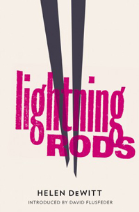
Lightning Rods - Helen DeWittLightning Rods by Helen DeWitt (And Other Stories – September 2012)
Honourable mention needs to be made of And Other Stories and their bold, graphic covers. The designs are not particularly exciting on an individual basis but together they create a very strong visual identity for the brand and, for my money, I think they did a better job on Deborah Levy’s Swimming Home, than Faber and Faber did with their generic ‘woman in swimming pool’ stock.


The Casual VacancyThe Casual Vacancy by JK Rowling (Little, Brown – September 2012)
And one that didn’t quite measure up to expectation – it has the fashionable bold graphic look and the customised type but somehow it lacks the personality of some of the designs above. Almost, but not quite.

Paralympic Games Opening Ceremony

I am slightly obsessed with night-time photography and photographing lights, particularly lights in motion – I like the spontanaeity and the unpredictability of it. On a trip to Paris a few years ago we had to visit all of the attractions twice so I could photograph each one in daylight and by night.

The Paralympic Opening Ceremony was a spectacular feast of colour and light and I’m very glad we were able to be in the stadium to experience it.